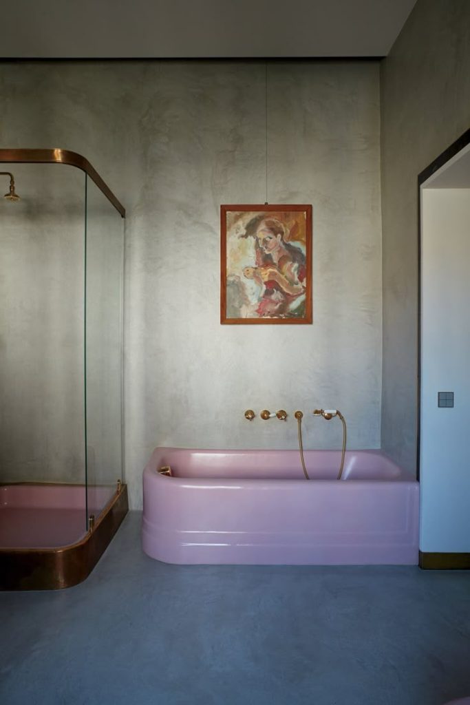
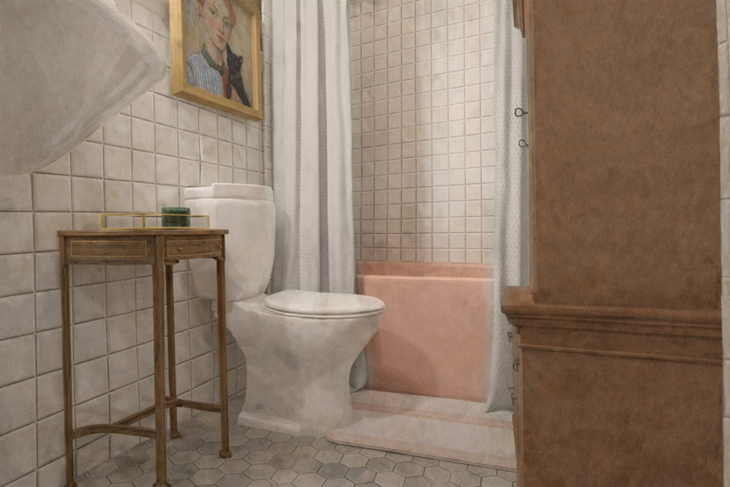
The first decision I made for this cottage was the tub. I knew she had to be saved from the main house renovation, and although she would have been great in one of the guest bathrooms, I wanted to be able to share her with our guests. Now, I realize that not everyone appreciates her pinkness quite like I do, nor would they choose to put her back into a renovated home. However, I do think our guests will appreciate this cheeky little surprise during their stay. At least I hope so!
Moving her was another thing altogether. I think it took four men to get her out, with a pit stop in the dining room for a few days.
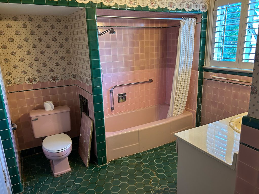
I did NOT however want an entirely pink bathroom. As a reminder, here’s where she hails from…
THAT WALLPAPER BORDER DETAILING WAS SOMETHING TO BEHOLD
While we LOVED the green hex tile and still have not given up on finding something similar for the master floors, we decided to go with a more crisp, clean, neutral look for the cottage bath—allowing the pink tub to be the splash. No pun intended.
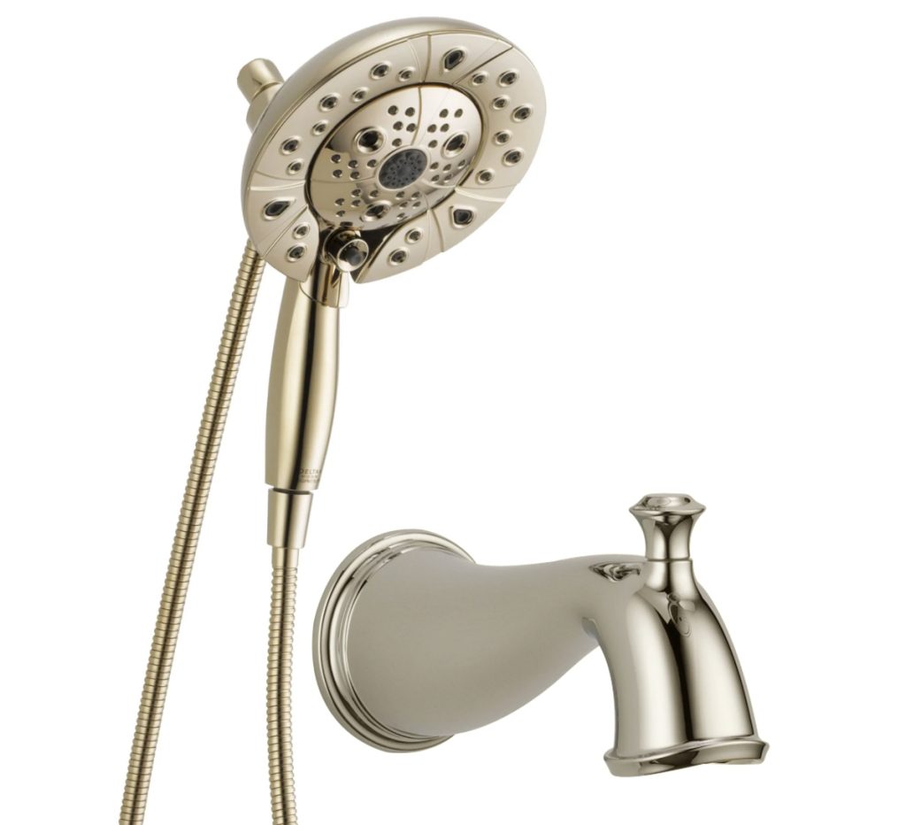
We went with polished nickel for our fixtures, which still had a little warmth and worked well with the brass accents.
DELTA – UNIVERSAL SHOWERING COMPONENTS – H2OKINETIC IN2ITION 5 SETTING TWO IN ONE SHOWER – LUMICOAT POLISHED NICKEL AND DELTA CASSIDY TUB SPOUT PULL UP DIVERTER – POLISHED NICKEL
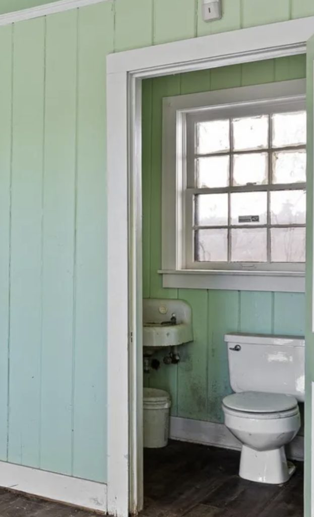
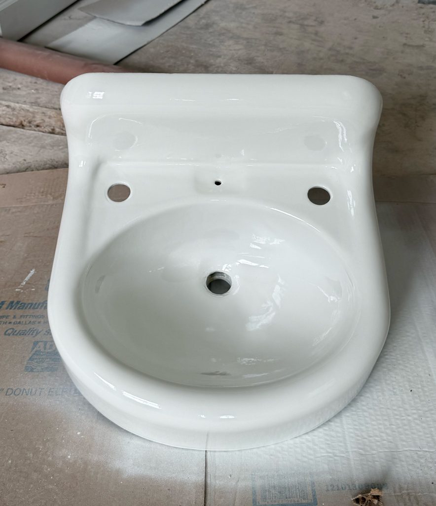
Another vintage gem we felt was worth rescuing was the little sink from the original cottage/garage space. Here’s where/how we found her…
YES, THIS IS WHAT OUR COTTAGE BATHROOM USED TO LOOK LIKE
HERE'S A CLOSER LOOK - YOU'RE WELCOME
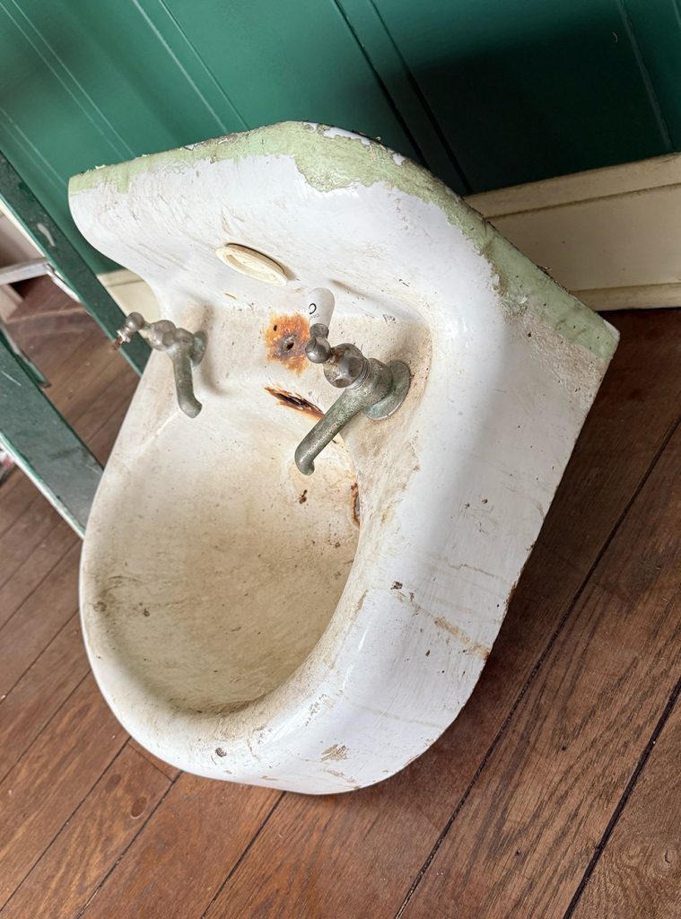
Funny—but not so funny—story. We’d asked our demo team to salvage and set her aside early in this process. I unfortunately arrived at the house for my normal gardening and found her not just in the dumpster, but at the bottom of it. Needless to say, I was not happy, but I jumped in that big yellow dumpster and fished her out. It was a slow and painful process. She may be little, but she is very mighty, and made from cast iron. I eventually got her out and was pleased that there was no one there to witness the pitiful scene that was.
I decided to quickly find someone to refinish her—for her own safety and mine. I was given info on Tubs & Tops, and after sending a quick text and photo of our sink, Carl was right over to pick her up.
She ended up being quite the challenge. She had a lot of rust to clean out and refinish, but also posed a challenge in functionality, so we had to get creative when ordering fixtures. The original fixtures were still intact but would not work for this space, as there was one faucet for cold and one for hot. To get warm water, you’d have to mix it in the bowl. Unique and nostalgic, but not functional for guests. So John at National Wholesale Supply was able to come up with a great solution with one hot/cold faucet and a soap dispenser to fill the other spot. Much more functional.
HERE SHE IS AFTER CARL WORKED HIS MAGIC
AND HERE’S HER JEWELRY. BRIZO BEAUCLERE SINGLE HANDLE LAVATORY FAUCET – POLISHED NICKEL AND BRIZO ROOK SOAP / LOTION DISPENSER – POLISHED NICKEL
With one dumpster dive, a miracle worker and a four-man moving team, two vintage fixtures were rescued. Now the challenge was to make them work in a new old space.
So with this in mind, off to Pinterest I went.
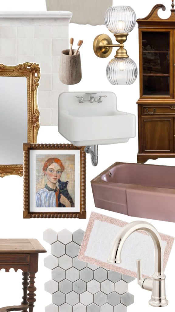
INSPIRATION
See the full cottage + bath inspo board or skip to the highlights…
COLORS
I considered wallpaper for this space, but did not want to compete with or take away from the gorgeous mural or grasscloth in the bedroom. So I decided to go with a wall color that worked well with the marble floor tile (more on that to come) and the wallpaper in the adjoining room.
I needed something warmer and a bit more exciting than white white and vowed not to put base white anywhere in this cottage or the main house. When I started this process, I chose base colors and dream colors. For example, the living room’s Blustery Sky was one of my dream colors. These were within the historic Tudor palettes that I knew I wanted to use variations of, but maybe didn’t know exactly where yet.
The base colors I knew would be in some of the main areas—like kitchens, hallways, and in this case, the bathroom. The dream colors would be bold statements, color-drenching entire rooms and mixed with wallpapers.
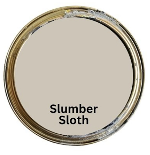
So of my base colors, I had Oat Milk, Loggia, and Slumber Sloth. All are of the same hue, but different shades of a warm white.
My challenge was not having any lights in the cottage for the entire project until about a week ago, and wanting to see the color in the exact space and lighting—while also picking a color in time for the painter (Cody) to work his magic. So while this sounds like it should have been an easy choice, color picking in the dark is NOT easy.
I second-guessed myself all the way until the entire room was painted and I saw it on the walls with the lights installed and on. But I’m excited to say it was the right choice. Oat Milk was too light and blended too well with the wall tile—needed a tad more drama. Loggia was too dark for the small space and too warm with the pink tub. So Slumber Sloth it was.
TILE
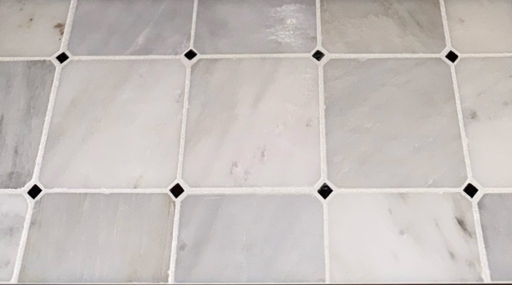
The day I went in to pick out all the floors for the cottage, I instantly fell in love with this beautiful marble tile. Literally saw it from across the room and decided it was the one. I didn’t look at another option for the bathroom floor that day.
However, once the flooring bid came in and I realized that this tile for the floor in our tiny cottage bath was more expensive than all the hardwoods, I decided to pick my battles—and another tile.
I was able to find something really close, but without those tiny little black diamonds. Apparently, that’s what makes this particular tile the price point it is: the installation and dealing with those tiny diamonds. The more you know.
I’m not giving up on it just yet. I would still LOVE to see it in the entryway of the main house, so I plan to revisit it then.
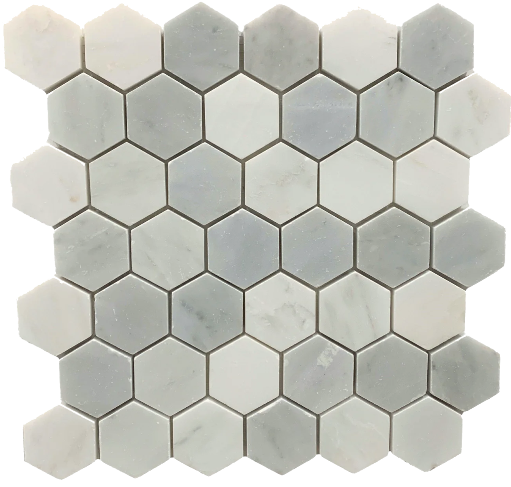
For now, I am just as in love with this tile for our cottage bath. Once again, Phillips Flooring did their thing and found me exactly what I was looking for—and in a (more) reasonable price range. I had to continually remind myself that this was ultimately a rental space and not to blow my entire budget before getting to my house. But look at it. So gorgeous. Even better in person and installed. Just you wait.
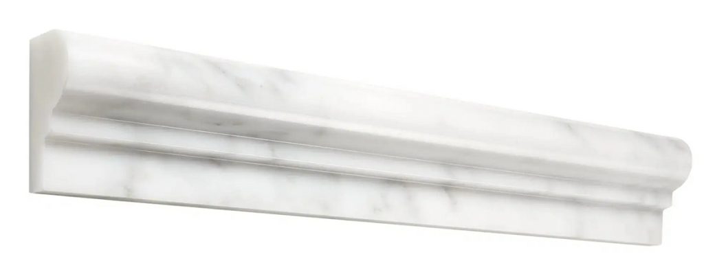
I also wanted a coordinating wall tile in a classic wainscoting, leaning on the higher side, with a marble chair rail to match the floors. These were my choices, and I love this classic look.
STYLING
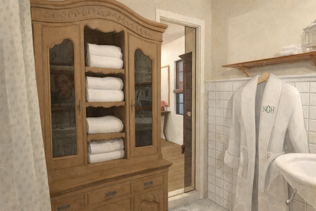
Storage: Without a lot of space to work with and a desire to keep that cozy cottage feel, I had to be super creative with storage. Our tiny 100-year-old hanging sink also didn’t provide much storage or surface area for getting ready.
So we will be adding a small antique china hutch for storing towels, toiletries, etc. I also found a beautiful antique brass hanging shelf in our attic that I’ll be using for hanging robes and additional items for guests. I found the perfect little table at one of my favorite antique stores that will sit between the sink and toilet for additional surface space when getting ready.
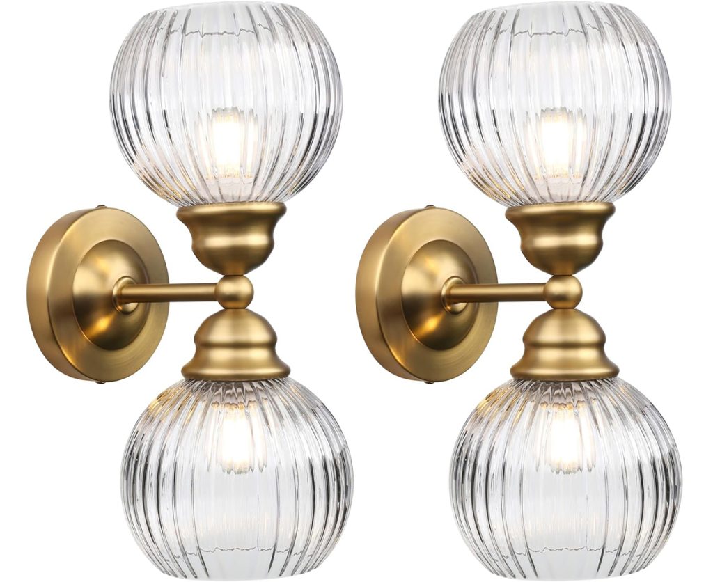
Lighting: In addition to canned lights (like we have in other areas of the cottage), I wanted to have sconces next to the mirror. There was pushback from the men in my life (as per usual), but we all know who’s boss here. These beauties add a ton of extra light and a bit of extra glam to this little space. I was disappointed to have to add the first – and only – non-vintage fixture to the cottage, but I feel like they fit in well amongst my oldies.
Decor: I’ll add plenty of art (don’t you worry) and more antique silver and brass décor to make her feel like home rather than a temporary stay. I will finish her off with a set of beautiful vintage minky fringe curtains I found at an estate sale a few weeks ago. These will be for the shower/bath but will need a bit of altering to fit the space the way I imagined. At least that is the plan so far.
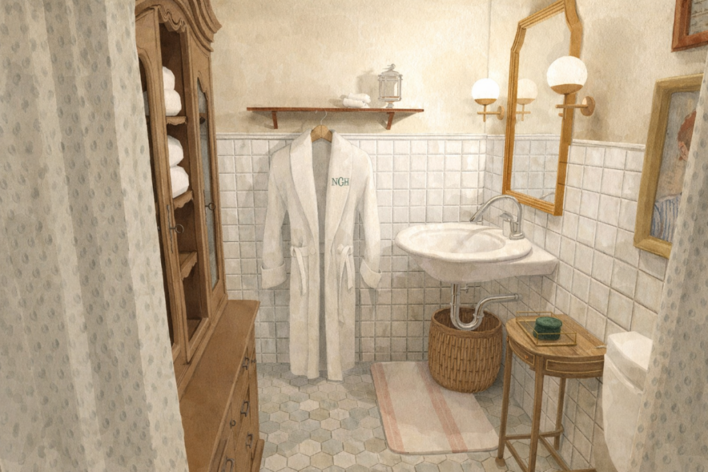
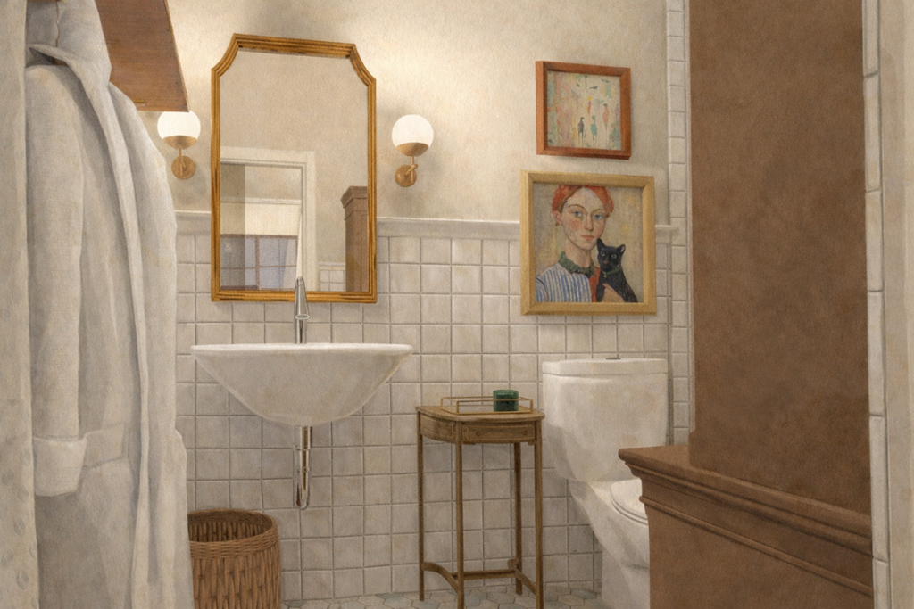
Here’s a look at how she looks in my brain…
Next up, believe it or not, we move in! I’ll share Cottage in Nuggett Hill before and afters, styling challenges, and cottage living adventures in upcoming posts, mixed with room-by-room renovation of the Tudor on Sixth.
My 2026 challenge is to make a post a week. We’ll see how that goes!